Tale of the tape.
Autograph isn’t like other real estate developers. From the ground up, they’re built differently. They have the vision to see potential, not just in a plot of land, but in the opportunity to change a neighbourhood. Where other developers see parking lots, they see vibrant communities. With a creative lens for beautiful design, genuine partnerships, meticulous attention to detail and follow-through on promises, they are proudly making a mark in their industry. Autograph is a modern take on the traditional values of real estate development, and they require an identity which reflects their distinctive approach.
Creative knockout.
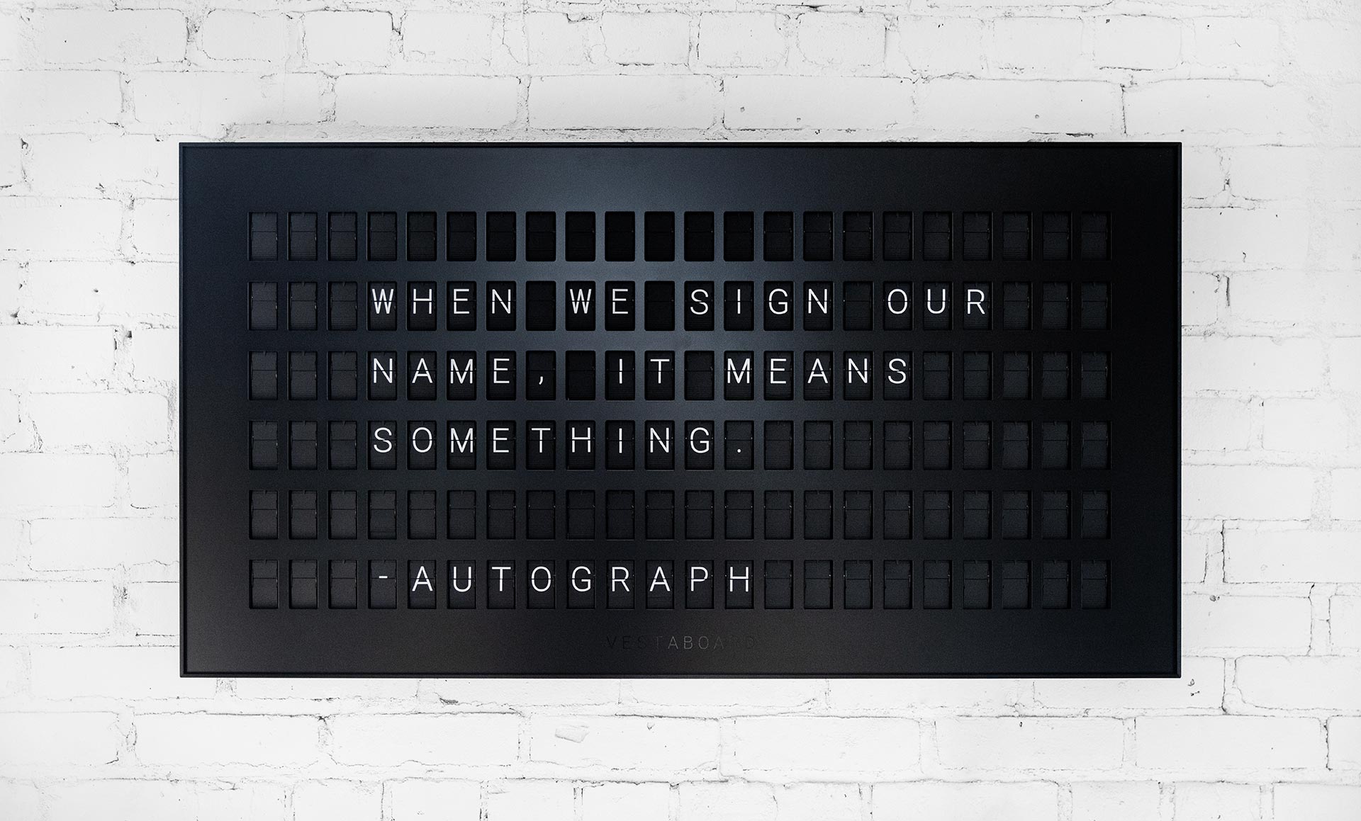
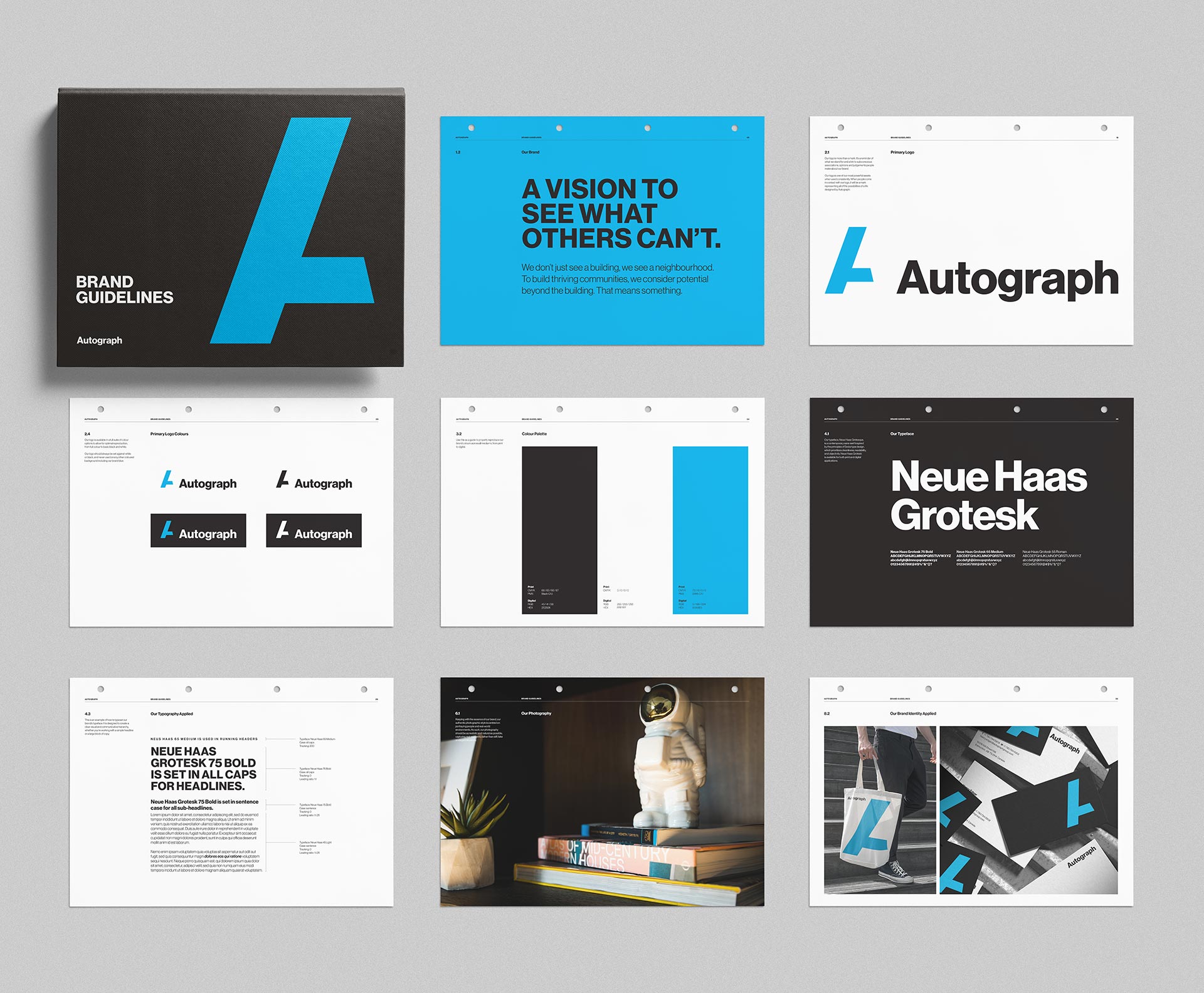
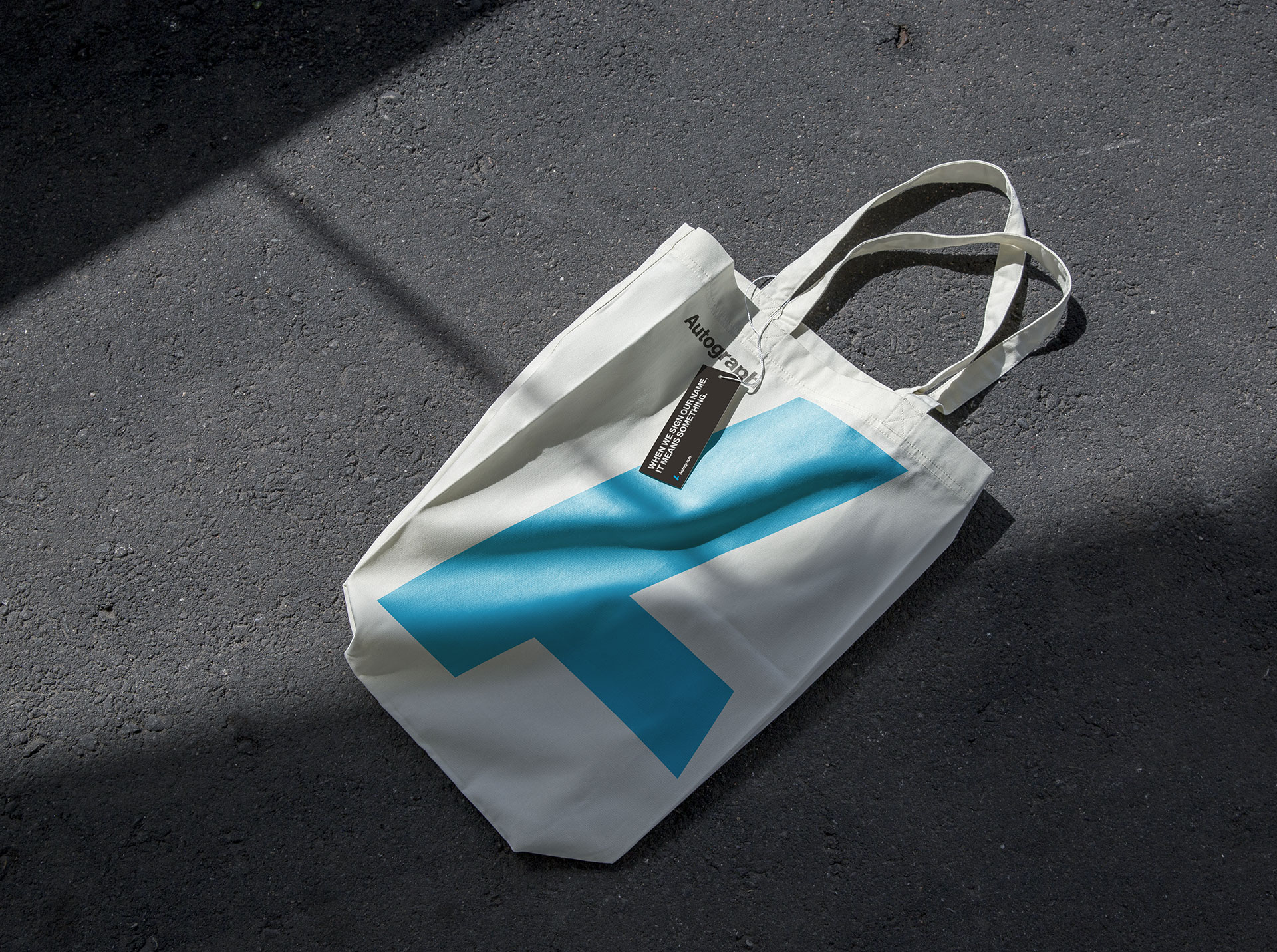
“When we sign our name, it means something.” This insight and the brand’s new positioning brought the new Autograph brand to life. The bold logomark takes the form of an abstract “A,” which not only strays from the obvious convention of a literal “autograph” but is also a visual representation of the unique buildings and communities that Autograph creates. The incomplete nature of the “A” is a graphical representation of Autograph’s never-ending drive and commitment to never settle and to make a positive and lasting impact with everything they do. Bold typography and brand narrative paired with a vibrant blue accent set against neutral backdrops create a feeling of strength, trust and approachability.
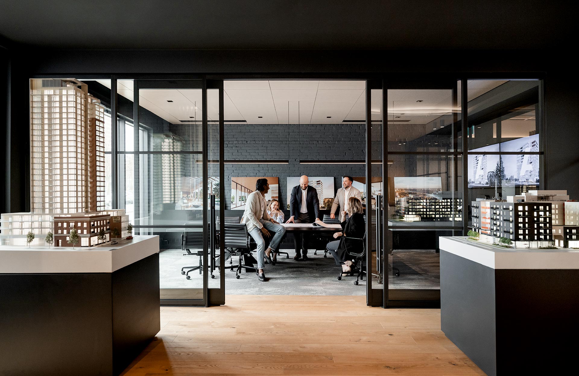
The new brand reflects internal pride in creating beautiful buildings and flourishing communities that stand the test of time.