Tale of the tape.
Midland is a leading household appliance dealer focusing on the upscale and luxury segments. The appliance category is saturated with competitors selling similar products with the same service promise, warranties, pricing, and sales cycle. It’s challenging to stand out and motivate customers to pick one dealer over another. Midland had successfully established a niche selling to a professional audience of builders, architects, and designers, but they reached a market share ceiling. In order to accelerate growth, they needed to branch out to a select mass-market audience.
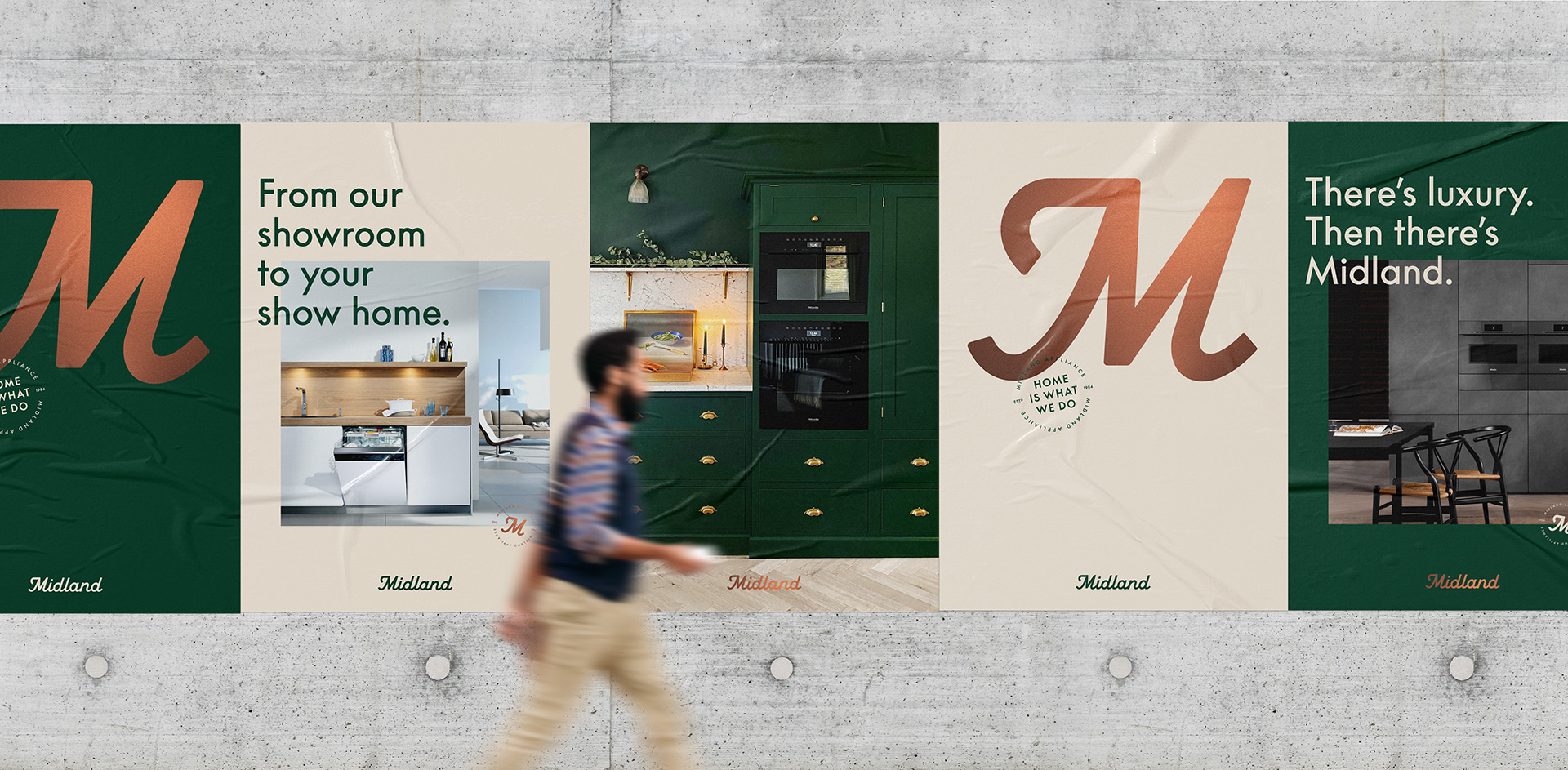
With a passionate team, unmatched knowledge, and an operations structure that puts the customer first, Midland wanted to express its difference to a broader audience. Our Brand Stance, A Beautiful Fit, highlights Midland’s service promise: a focus on relationships and client commitment. A Beautiful Fit celebrates all the ways that beautiful appliances make a home.
Creative knockout.
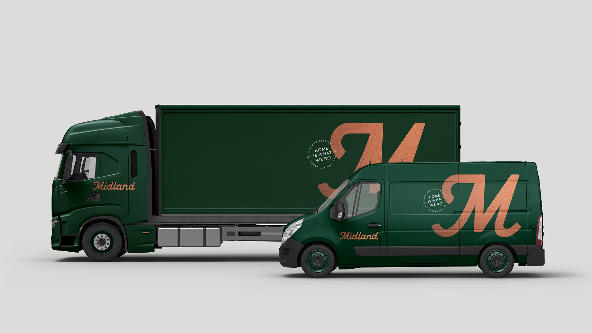
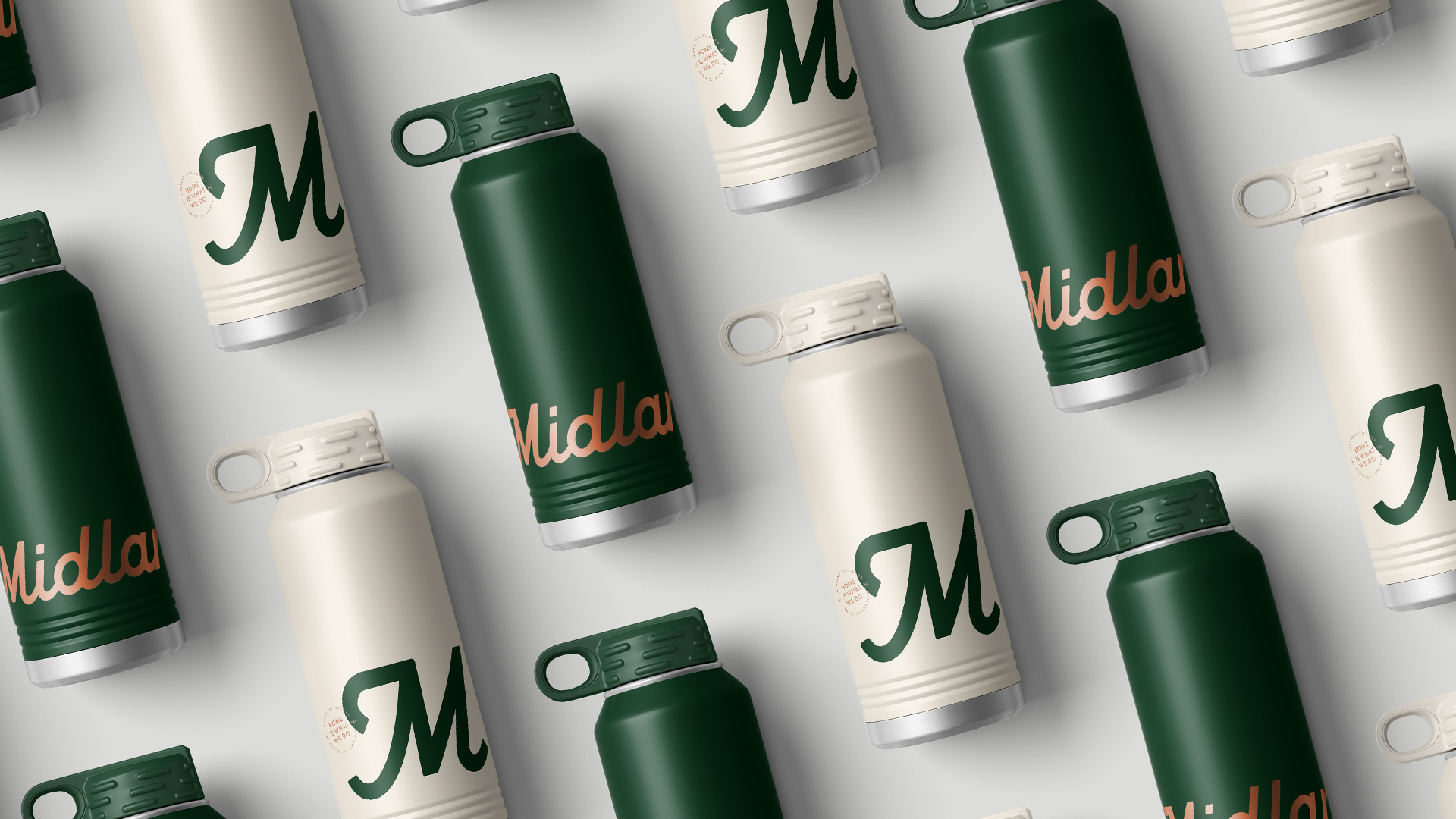
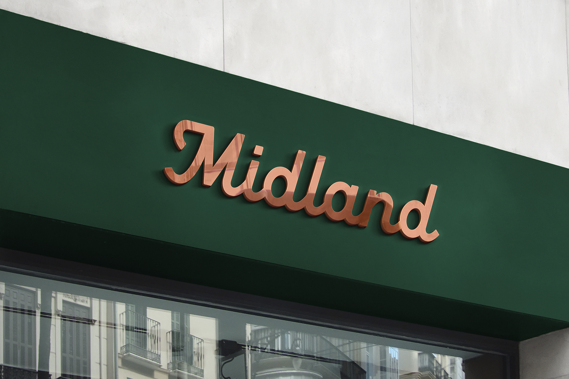
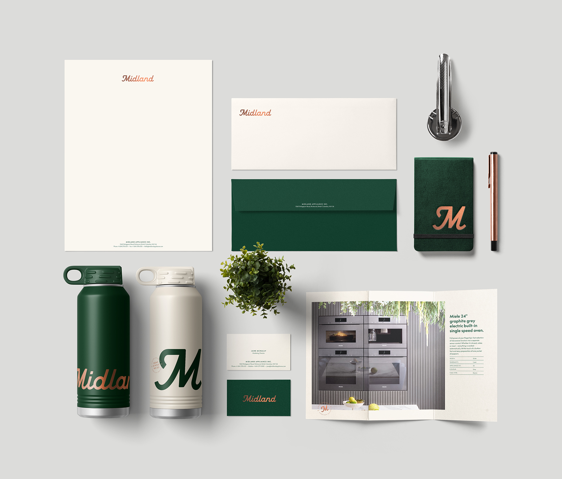
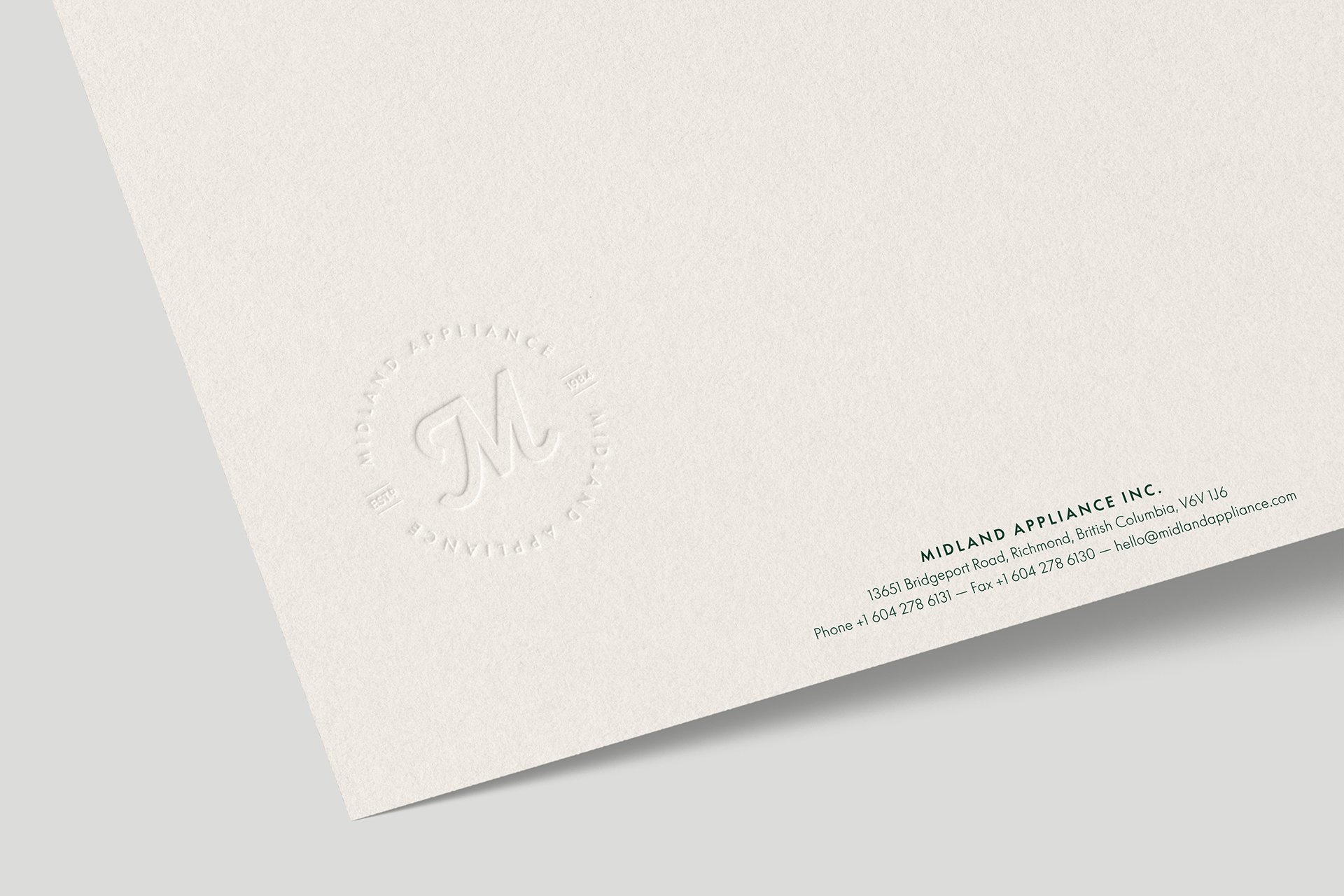
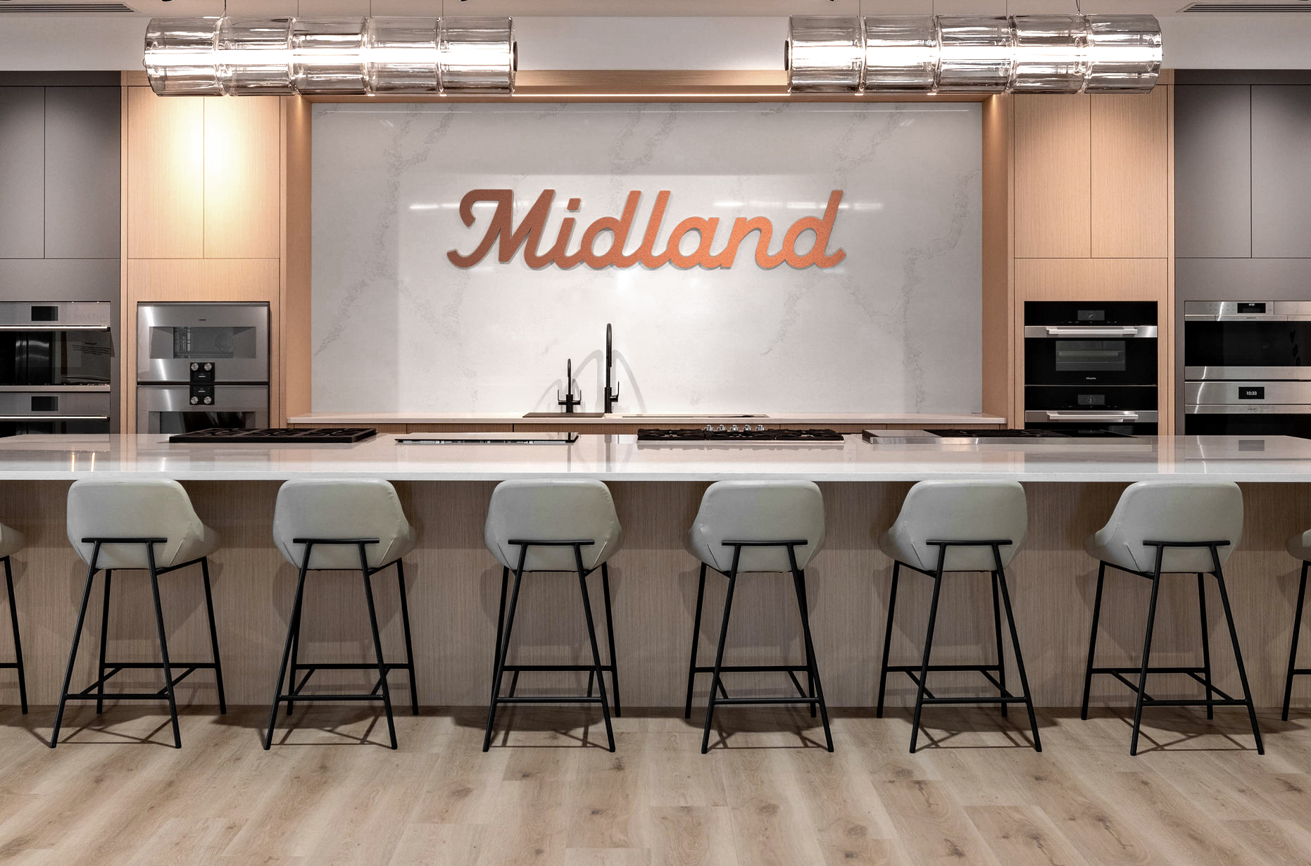
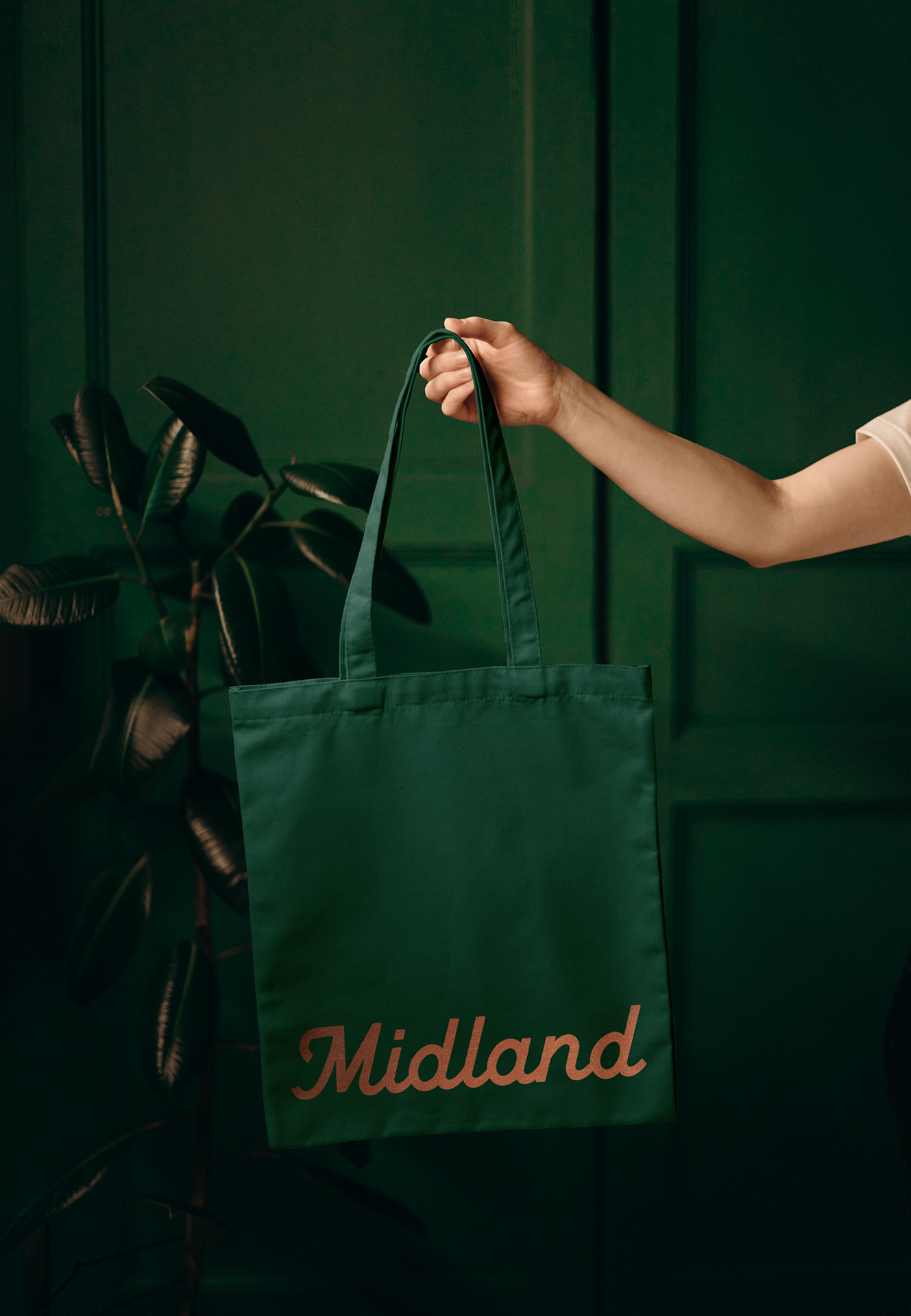
Using A Beautiful Fit as the filter for a new identity, we elevated the Midland brand by leaning into premium elements like a new bespoke wordmark, symbolizing craftsmanship and quality. Copper was selected as an accent colour as a nod to cookware found in classically upscale kitchens. We then paired the copper with a beautiful, rich green that feels both premium and timeless. The new brand shows how a Midland home is where everything good comes together—it’s how we deliver on the promise of A Beautiful Fit.